Sunday, 29 September 2013

Thorsten Brinkmann

Photography with Andy Dolan


'Portraits of a Serial Sammler'- Thorsten Brinkmann


Our interpretation of Brinkmann's work.


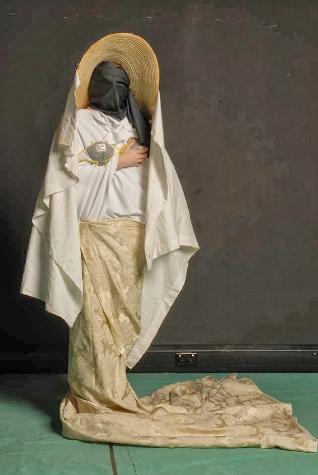
'Bride'- Sheena and Chloe


I really enjoyed this photography session as we were able to
interpret Brinkmann's work using our own choice of items
and materials. I think the outcome was very successful.

George Tice

'Petit's Mobil Station, Cherry Hill, New Jersey, 1974'- George Tice


The eeriness of this particular photograph by George Tice appeals to me as the black and
white colours bring this idea alive and gives it a vintage effect, with the concept of the
car and it's surroundings. The estranged car makes the photo have a mysterious feel to it,
as a petrol stop is usually lively.


Sally Mann

'At Twelve'- Sally Mann


Sally Mann's work is absolutely stunning. I love the concept of her photographs and how each
piece looks as though there is a story behind it. The mysteriousness of the girl holding a
cigarette really appeals to me as it is unusual and I like the extraordinariness it brings to the
photo. I also really like how Mann's produces only black and white photographs.


Sculpture Making


Here I produced a sculpture of an oil can I had previously been studying. Before making this sculpture, I did a study of the original item using black ink, which was sprayed and drawn with using a stick. I then used that piece to produce this sculpture, giving it an unusual but fascinating effect. I really liked experimenting with different ways of drawing using natural resources, like the range of sticks I used. I used spray to give the drawing a different effect which I liked. This technique can be linked to John Virtue who also uses spraying in his work.

John Virtue


'London Paintings'- John Virtue is inspired by landscape paintings and has done a number of
impressive London landscape paintings himself. He first produces a range of on-site sketches
in order for his much larger paintings to be accurate and then transfers these on to a canvas
using black ink. Virtue has recently been using titanium white acrylic and black ink, as the
contrast between black and white makes it more expressive and forces him to be inventive.
I think Virtue's work is fantastic because although he uses thick brush strokes and layers of ink
and acrylic, he has produced a very detailed painting of London. It also inspires me to work
with a range of techniques including spraying. 

Sunday, 15 September 2013


Hamish Fulton 

Earthworks and Beyond- Hamish Fulton
 
Like Richard Long, Hamish Fulton uses walking as an inspiration to his work, however he presents
it in a graphic way, using more text than image. I like how he translates his journeys in to graphic
illustrations and advertisements, as it is different to what other artists may do.

Andy Goldsworthy

Untitled- Andy Goldsworthy


I really like the execution and complexness of Goldsworthy's work, which he creates using a
great deal of natural objects and materials he finds, such as flower petals, sticks, icicles
and rocks. I particularly like how the colours blend together in this piece as it shows the
beautiful shades of warm colours found in nature. Goldsworthy has created a sculpture show
casing the attraction of leaves, which we often overlook.