Friday, 1 November 2013
Matthew Williamson

From daisies to polka dots, and billowing dresses to pencil skirts, Matthew Williamson's 2014
spring/summer collection is one to be loved. The use of bold colour brings a refreshingly
feminine feel to this cobalt blue chiffon dress that flows down the runway to exaggerate the
use of colour and simplicity of prints. I love the pleasant feel Williamson's pieces bring,
especially the garment below that embraces an extravagant yet satisfying number of daises
to create this beautiful dress and I particularly like the different shades of blue Williamson
has used in this collection.

Stefan Sagmeister
 |
| 'Having Guts Always Works Out For Me'- Stefan Sagmeister |
Stefan Sagmeister is a graphic designer and typographer who uses the design around him to
create images of text in an unusual form. I find it really interesting how Sagmeister uses art
around him to expand his idea of it and incorporate writing to create a fascinating piece of
typography. I particularly like this piece and the choice of materials used. The combination
of bare fabric against the background of trees work really well together as the text stands
out from the image, although the trees are still visibly a main part of the piece.
Exploring Colour and Compostion
Matthew Harris
 |
| 'Lantern Cloth'- Matthew Harris |
Matthew Harris is a textile artist who uses dying, cutting and hand stitching. Harris creates
his pieces using these methods and explores colour, repetition and pattern to produce a
textured surface to his work. I particularly like this piece as he has worked directly on to
cloth and created an abstract image that includes a range of marks and block colour that
exaggerate this piece. Focusing on certain objects, I created a series of pieces that link to
Harris' work, focusing and experimenting on colour and compositions. I wanted to limit my
colour palette so I focused only on a few colours and textures.
My outcomes-


3D Work
I was given the word 'insert' and told to expand my ideas on what this word really means and how it can be interpreted in different ways. I brainstormed around this word and thought of ways this word is used, such as a plug socket. After coming up with a variety of ideas, I chose to focus on a key-hole for my final design. I created a key and a key-hole out of different thicknesses of wire.My final outcome-


Rowan Mersh

Like Nora Fok, Rowan Mersh creates jewellery that is widely exaggerated
although he has a more experimental approach and creates his pieces
through technique and design. I really like how Mersh's work emphasises
shapes within the piece and the material being used and how the jewellery
being created can be regarded as sculptures. The detail of this particular
piece fascinates me as he has been successful in creating such a delicate
design using just the simplest of materials.

Nora Fok

Nora Fok is an expressive artist who's ideas are personal and distinctive. Fok's delightful and
intricate compositions are translated using her unique ability. She sets out to capture the
different aspects of nature and structure in her work, and is often intrigued by the world
around her. As her work is processed by hand, using only basic tools, it requires hours, days
and weeks to produce such complicated designs. I constructed a three dimensional response
to her work and created my interpretation of the image above. I wanted to capture the
delicate designs of her work in to mine so i used only card to create it.
Here is my response.


Sunday, 29 September 2013
Thorsten Brinkmann
Photography with Andy Dolan
 |
| 'Portraits of a Serial Sammler'- Thorsten Brinkmann |
Our interpretation of Brinkmann's work.
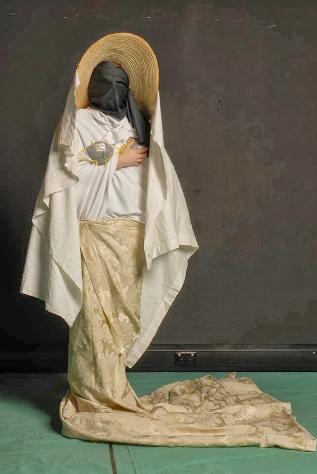 |
| 'Bride'- Sheena and Chloe |


I really enjoyed this photography session as we were able to
interpret Brinkmann's work using our own choice of items
and materials. I think the outcome was very successful.
George Tice
 |
| 'Petit's Mobil Station, Cherry Hill, New Jersey, 1974'- George Tice |
white colours bring this idea alive and gives it a vintage effect, with the concept of the
car and it's surroundings. The estranged car makes the photo have a mysterious feel to it,
as a petrol stop is usually lively.
Sally Mann
 |
| 'At Twelve'- Sally Mann |
Sally Mann's work is absolutely stunning. I love the concept of her photographs and how each
piece looks as though there is a story behind it. The mysteriousness of the girl holding a
cigarette really appeals to me as it is unusual and I like the extraordinariness it brings to the
photo. I also really like how Mann's produces only black and white photographs.
Sculpture Making


Here I produced a sculpture of an oil can I had previously been studying. Before making this sculpture, I did a study of the original item using black ink, which was sprayed and drawn with using a stick. I then used that piece to produce this sculpture, giving it an unusual but fascinating effect. I really liked experimenting with different ways of drawing using natural resources, like the range of sticks I used. I used spray to give the drawing a different effect which I liked. This technique can be linked to John Virtue who also uses spraying in his work.
John Virtue

'London Paintings'- John Virtue is inspired by landscape paintings and has done a number of
impressive London landscape paintings himself. He first produces a range of on-site sketches
in order for his much larger paintings to be accurate and then transfers these on to a canvas
using black ink. Virtue has recently been using titanium white acrylic and black ink, as the
contrast between black and white makes it more expressive and forces him to be inventive.
I think Virtue's work is fantastic because although he uses thick brush strokes and layers of ink
and acrylic, he has produced a very detailed painting of London. It also inspires me to work
with a range of techniques including spraying.
Sunday, 15 September 2013
Hamish Fulton
 |
| Earthworks and Beyond- Hamish Fulton |
Like Richard Long, Hamish Fulton uses walking as an inspiration to his work, however he presents
it in a graphic way, using more text than image. I like how he translates his journeys in to graphic
illustrations and advertisements, as it is different to what other artists may do.
Andy Goldsworthy
 |
| Untitled- Andy Goldsworthy |
I really like the execution and complexness of Goldsworthy's work, which he creates using a
great deal of natural objects and materials he finds, such as flower petals, sticks, icicles
and rocks. I particularly like how the colours blend together in this piece as it shows the
beautiful shades of warm colours found in nature. Goldsworthy has created a sculpture show
casing the attraction of leaves, which we often overlook.
Richard Long
 |
| 'White Mud Circle'- Richard Long |
Richard Long is known for his inspiration of taking walks through rural and remote areas in
Britain, to help produce sculptures and paintings using only raw materials such as, rocks
and mud. Long has created this piece using white mud which he poured to construct the
circular base shape of the design. He then wiped the mud to create the surrounding effect.
I find the idea of using natural materials very fascinating, especially as he has managed to
produce such a skilled and fine sculpture which I take much interest in.
Tuesday, 10 September 2013
Gerhard Richter
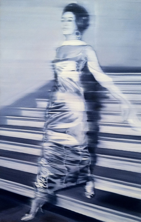 |
| Woman Descending the Stairs- Gerhard Richter |
This particular piece by Richter appeals to me as it was
originally just a photograph. However, Richter has
enlarged the photograph and printed it on to a canvas
which he then smudged to create the blurred effect of
the woman descending the stairs. The metallic colours
enhance the classic look of this piece.
Hew Locke
 |
| Jungle Queen II- Hew Locke |
With the use of different types of materials and textures, such as flowers
being layered together, Locke has created an unusual yet enchanting
representation of the Queen. I like the simplicity of the technique used as
it involves mixed media being glued onto a cardboard base, yet creating a
complex looking piece.
Cindy Sherman
 |
| Untitled 153- Cindy Sherman |
Sherman's work is often mysterious and haunting as they are inspired
by the horrific truths of fairy tales. They portray different elements
found in fairy tales, such as murder which this particular piece
emphasises. The combination of materials make her work seem unreal.
I appreciate the mysterious element of the piece and how each defining
detail allows us to unravel the deeper meaning, although it still remains
somewhat unknown.
Monday, 9 September 2013
Susan Hiller
 |
| Witness 2000- Susan Hiller |
Susan Hiller perceives different cultures and approaches them in a way that many artists
wouldn't. Hiller focuses on the idea of the unknown, and in this piece each speaker
transmits a voice telling different stories of their encounters with UFO's. The dreamy
lighting gives an indication of extra-terrestrial activity, making the experience more
realistic for the viewer.
Annette Messager
 |
| The Messengers- Annette Messager |
'The Messengers' is inspired by the dark side of childhood which Messager has portrayed in a
sculpture of numerous types of soft toys, this makes it seem like it tells a strange story which
I like the idea of. As you examine the piece and look closely, some of the toy heads have been
replaced with other animals heads, reflecting the way humans often hide their true character,
giving it a deeper sense of identity.
Sarah Sze
 |
| A Swiftly Tilting Planet- Sarah Sze |
From water bottles and lamp shades, to wires and ladders, whether they are hanging from ceilings or just simply placed on the ground, the combination of ordinary objects used in Sarah Sze's work brings a new idea to items we wouldn't necessarily find interest in. I like the idea of her designs as they are distinctive and use everyday items that draw the recipient in to admire the intricacy and every detail or her unorthodox sculptures. The combinations of colour and shapes and precise placement of every little piece leaves the viewer wondering the true meaning of her work.
Subscribe to:
Comments (Atom)